
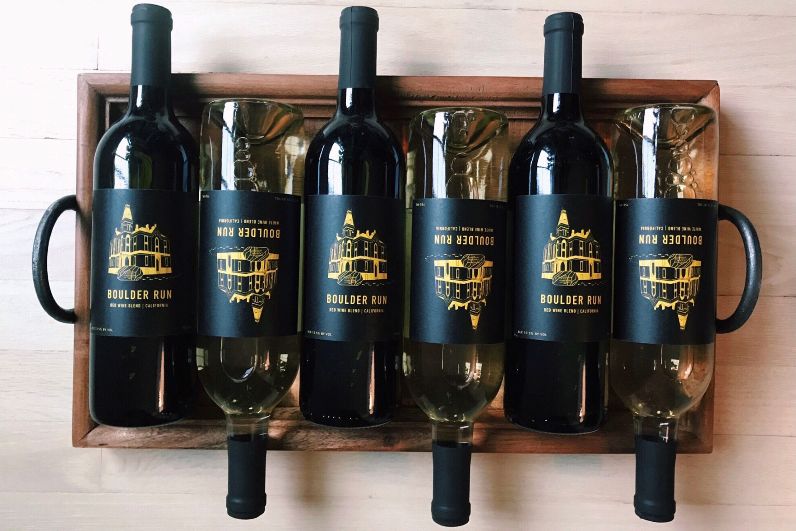
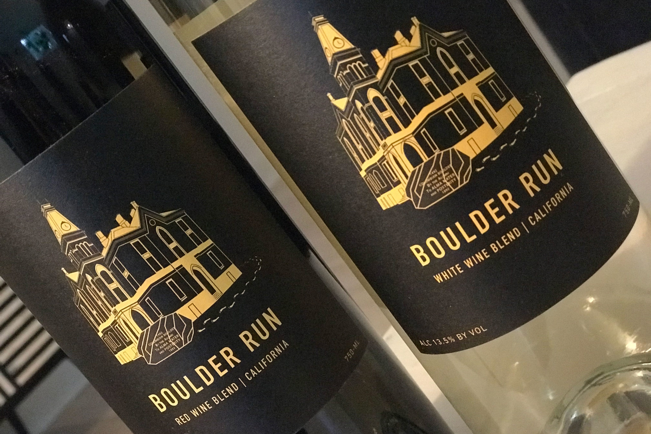
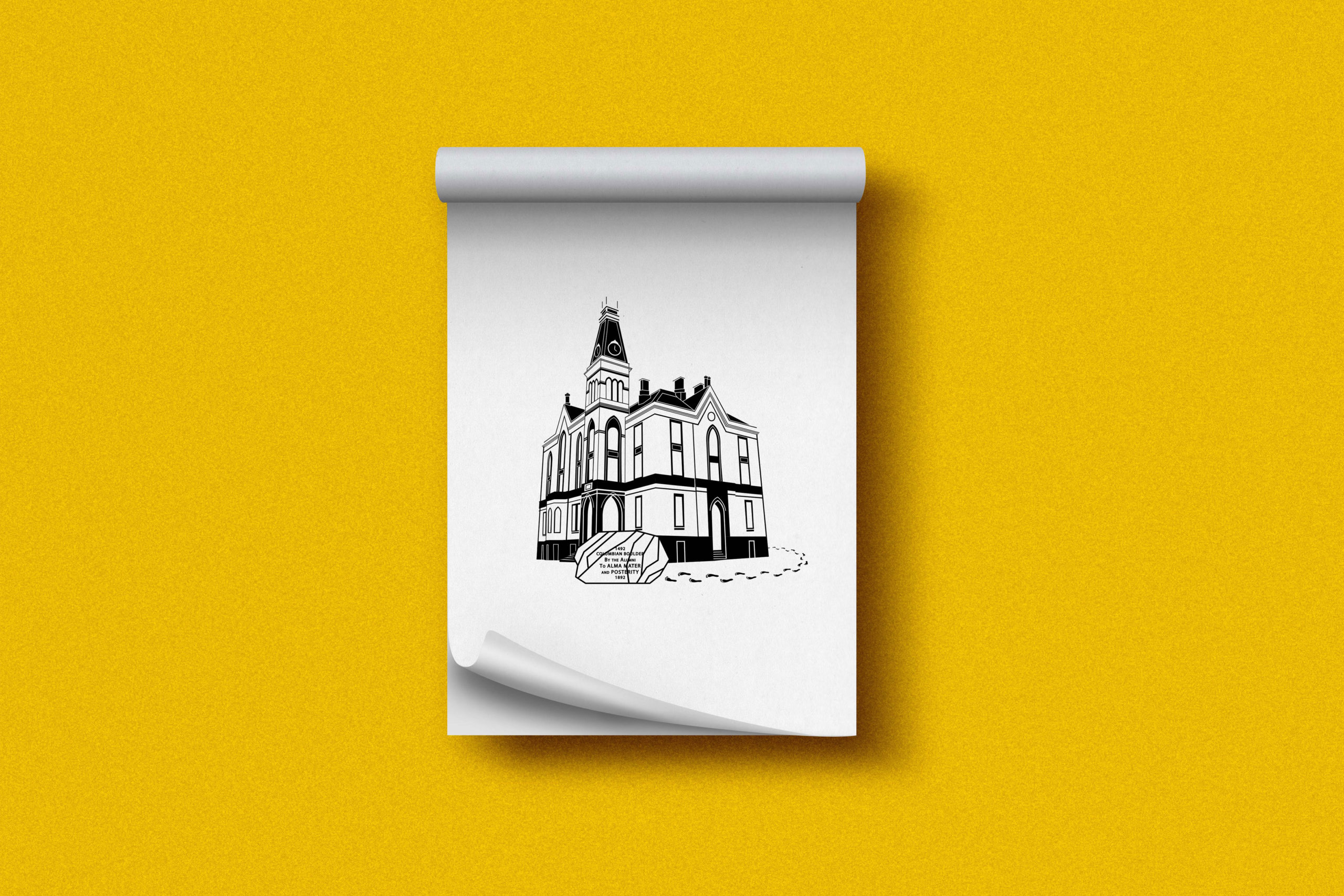
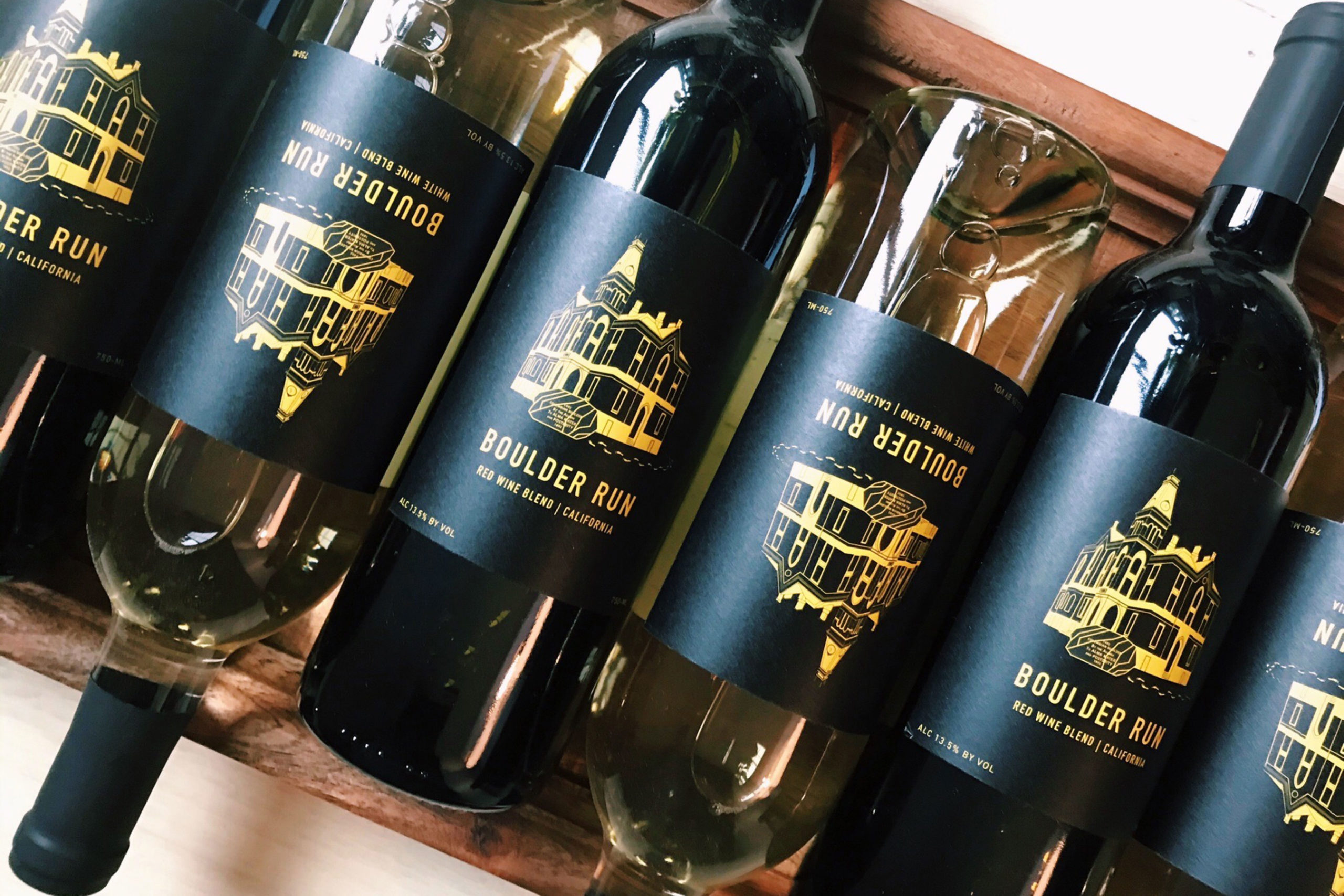
Boulder Run for University Vines
The history of the “Boulder Run” rests mainly in the Boulder, so I decided, with the client, to make this and the iconic East College building the focal point of the label. To create a classic look, I developed a detailed drawing of the building, consisting of simple, clean lines and shapes. The modern flare was added with the addition of the font DIN for the wine name and details. Straight from Depauw’s colors, the yellow and black create a bold, unmissable contrast.