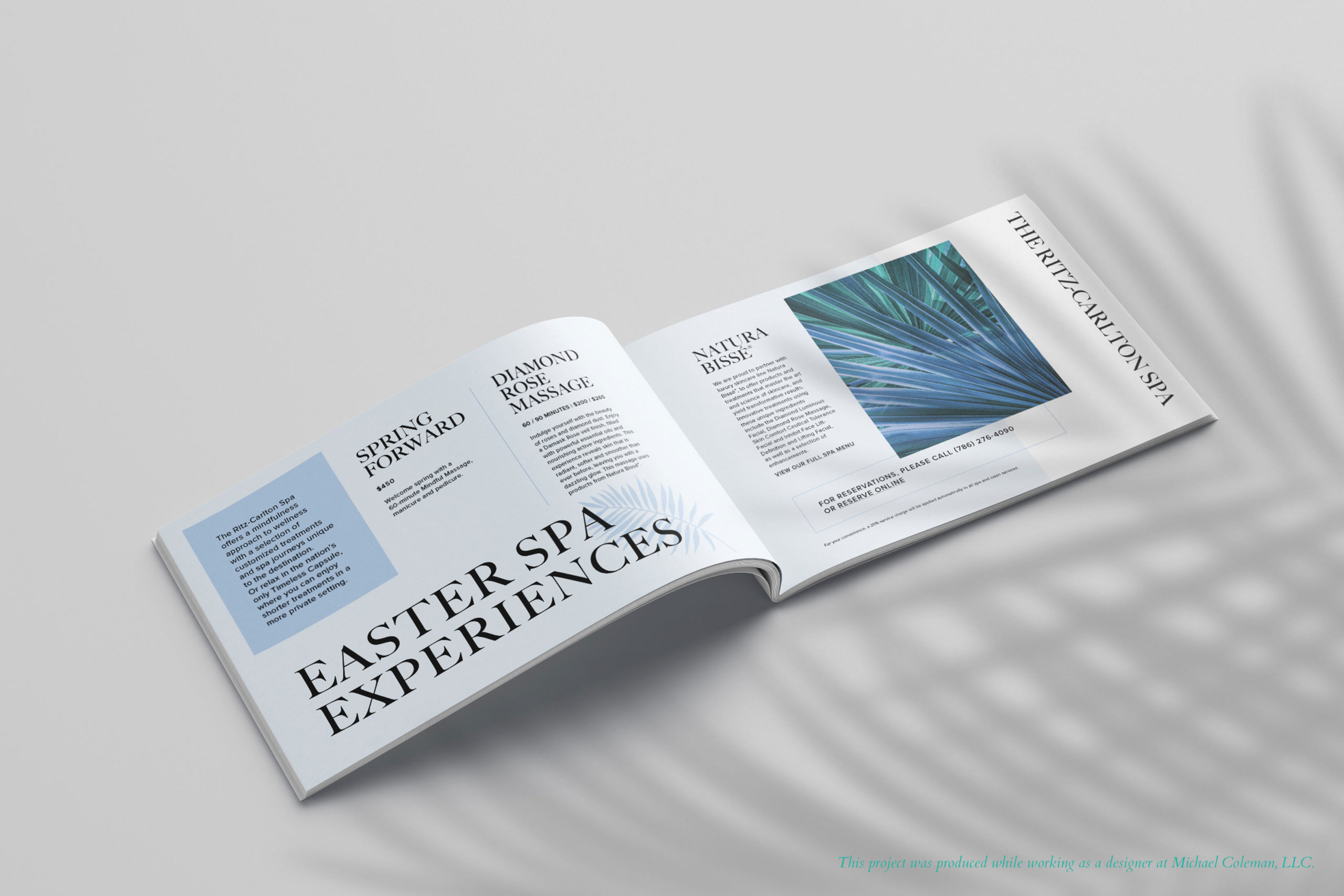
Ritz-Carlton Easter Brochure
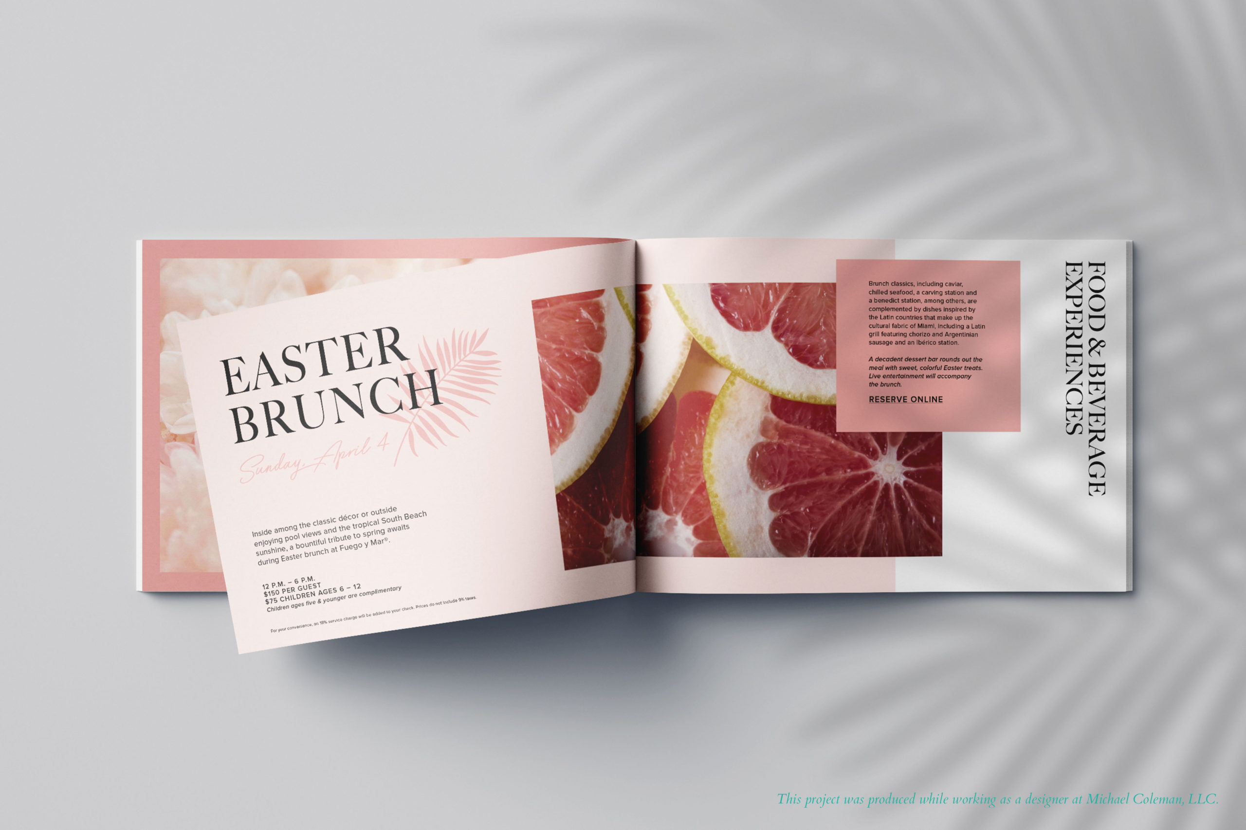
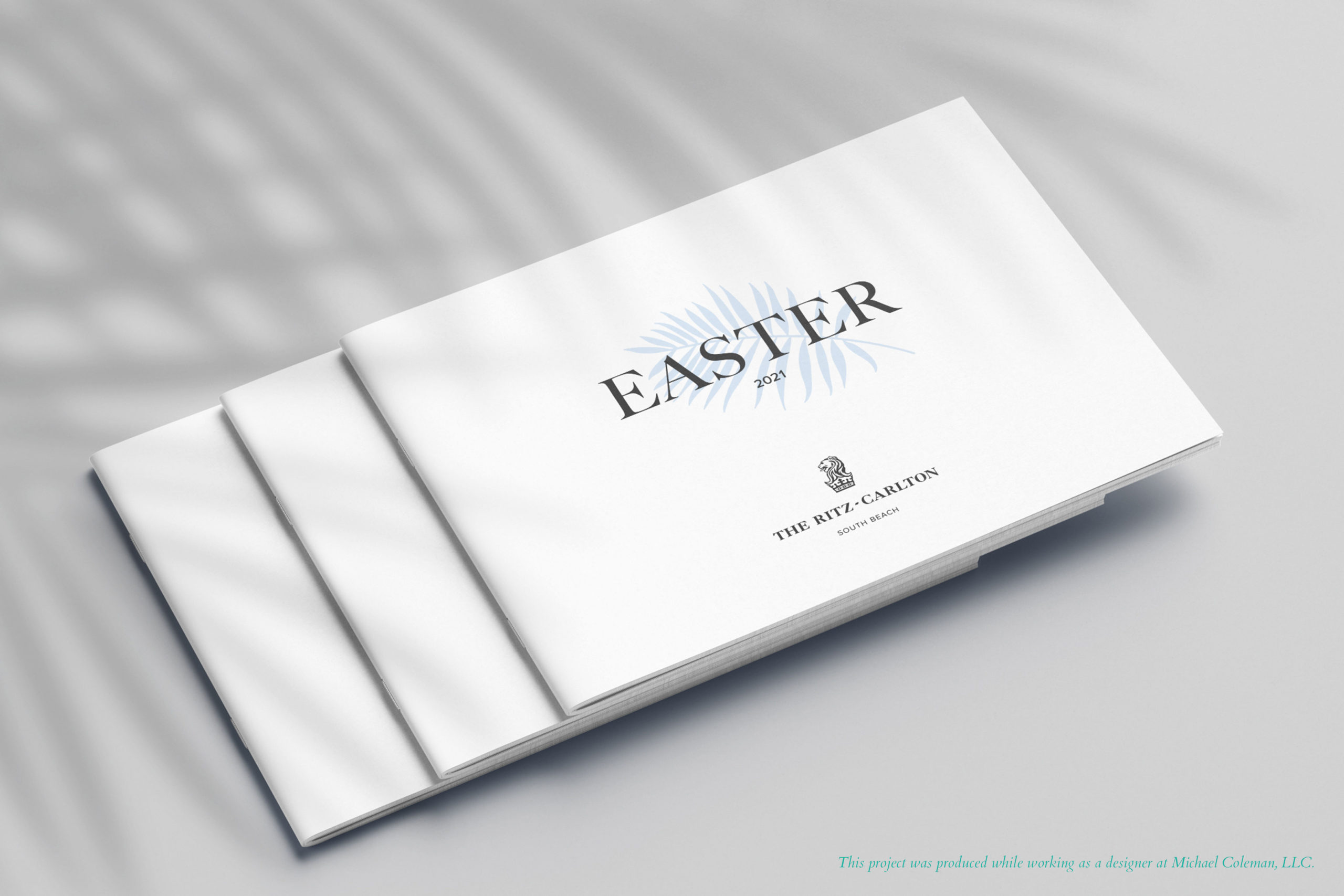
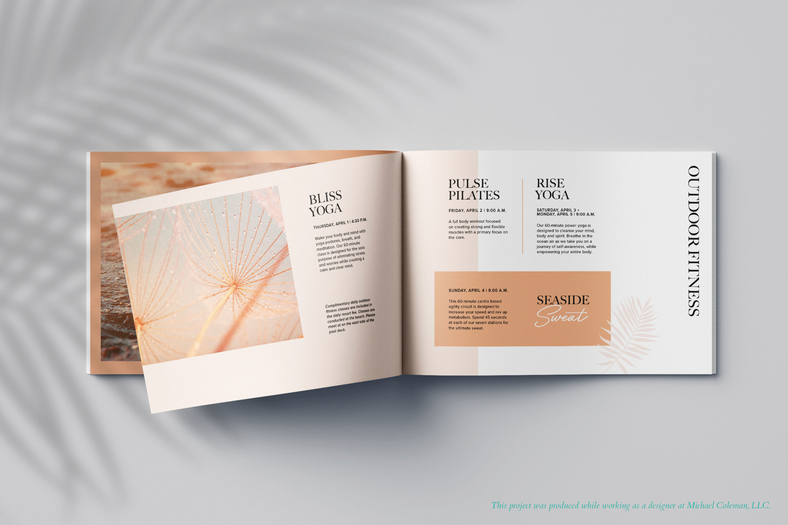
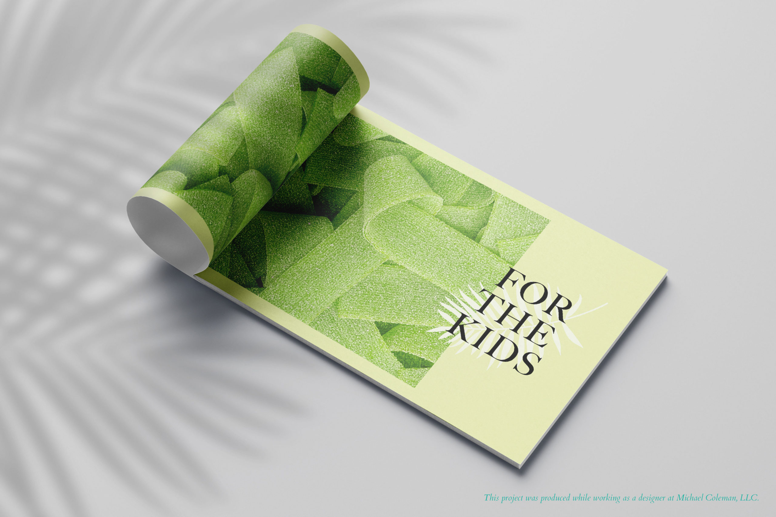
South Beach is known for its vibrant culture and color. Using this as inspiration, I pulled in pastels to brighten up the brand color palette of pale blue, black, and white, giving each section of the brochure its own hue. The Art Deco style of the building, inspired the structure of the page layout. All horizontal lines and layers line up on a grid and overlap occasionally to play up the modern look. The hotel was lacking in photography of the property, so I pulled in bright, textural images with the goal of drawing the viewer’s eye and preserving the South Beach liveliness.
This project was produced while working as a designer at Michael Coleman, LLC.

