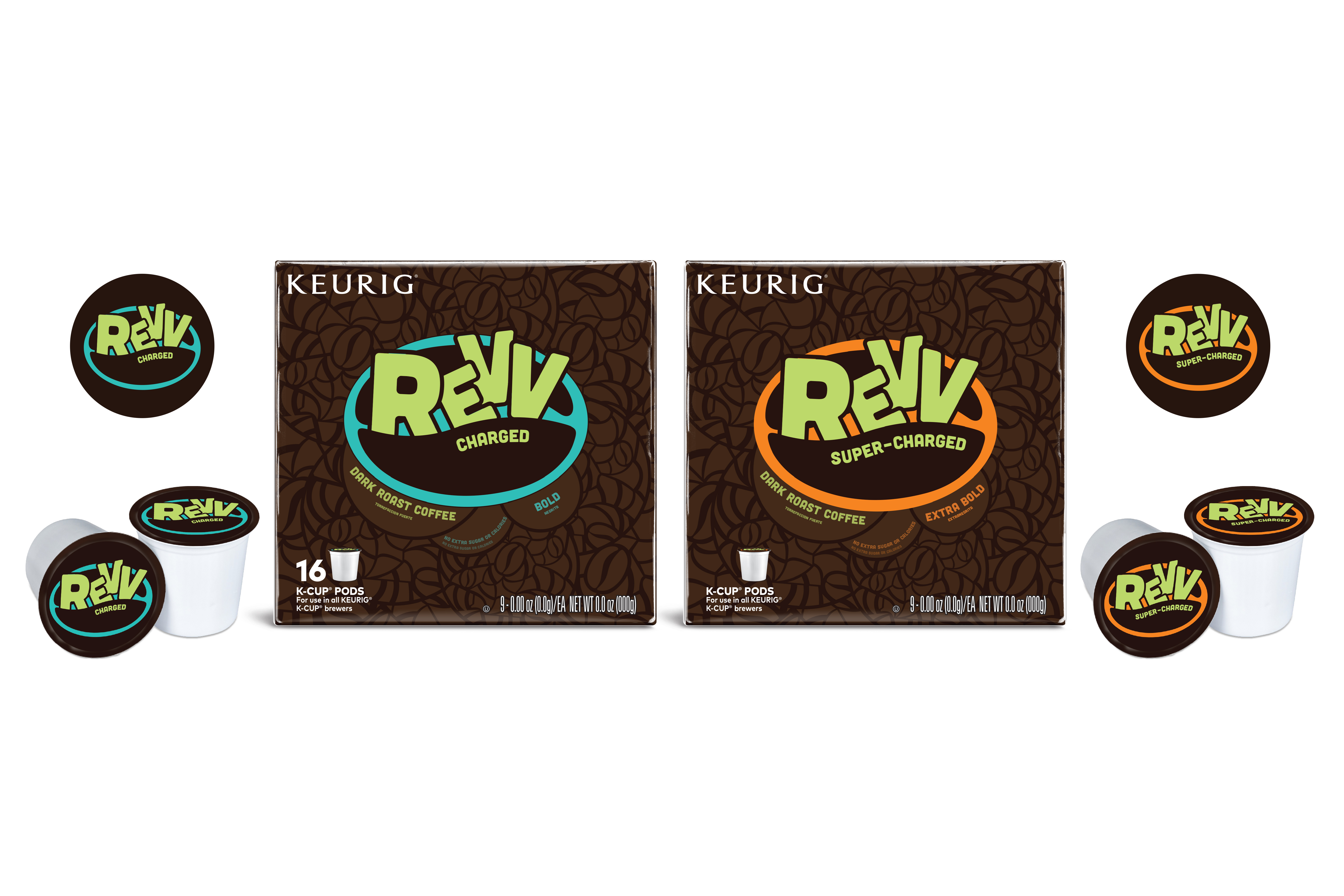
15 Feb Revv Rebranding
Challenge | Redesign the logo and packaging of the coffee brand, Revv, to clearly establish that Keurig is offering a dark roast that will super-charge your day without extra sugar or calories and increase overall brand awareness. This project was done in collaboration with Interbrand, a design firm in Cincinnati.
Solution | Inspired by the concept of “Wake up!” and the idea of Revv coffee being bright, refreshing, and lively, I worked with the shape of the coffee bean and popping colors. I used the coffee bean shape as both a texture and feature within the logo. The type within the logo and bright colors were combined with the intention to communicate the vibrant energy Revv coffee gives its consumer.

Sorry, the comment form is closed at this time.